Typically, it’s April and I only just starting to upload 2017’s book arts pieces!
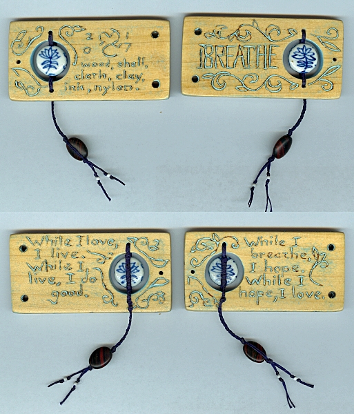
Here are the roughly 1.5x3x.25″ faux-inlay covers (outside and inside) for BREATHE. I showed a first look at the pages last year. They’re a gathering of Latin mottos I thought were particularly appropriate for the current state of the world:
Dum Spiro Spero. Dum Spero Amo. Dum Amo Vivo. Dum Vivo Prosum.
While I breathe, I hope. While I hope, I love. While I love, I live. While I live, I do good.
The covers give rough English translations, along with the title, colophon, my sigil and date made.
I chose poplar because it’s a fairly hard, very fine-grained wood that takes well to woodburning. When properly varnished, good poplar feels and ‘pings’ almost like porcelain or bone.
Text and designs are burned in with a pyrography pen. You can’t see it in these scans, but I did scrollwork on every edge. It came out yummy.
I sanded and scrubbed away the burn resins (otherwise the paint won’t stick!), then filled the channels with a thickened tinted acrylic (in this case, Indigo and Titanium White). When that dried, I sanded it again until most of the wood was clean, and most of the burned channels were still filled with a paint ‘inlay’ with a fine dark brown outline. It’s not an exact artform: you can see where I sanded out the paint on the word ‘breathe’ on the lower right image.
Alert readers will have seen me try this out here. I’ve been farting around with this technique for over ten years, but this and the blood orange wand are the first times I’ve been mostly happy with the look. Hint: fine-grained wood is the key. Wengewood, purpleheart, and oak have too much open grain that collects the paint and obscures the drawing (see where I messed up on CONTINENTAL DIVIDE and CITY AT NIGHT).
When sealed with a UV resistant lacquer varnish, the silky grain of the poplar shows up in a figured pattern, with a lot of surface translucence that offsets the opaque paint.
The beaded accents are from the 30-Year Stash: blue and white porcelain inside the cover holes, with matte green/red striped ‘onyx’ glass and pale gray-purple matte seed beads. I thought these picked up the dark blue, lavender, buttercreme, and ice-blue colorways and floral theme of the fabric pages.
Thread is Navy Blue waxed polyester from Maine Thread Co.
And now on to join pages and covers! More on the finished piece here.